Vogue is a monthly fashion and lifestyle magazine that covers various topics, including haute couture fashion, beauty, culture, living, and runway. Vogue Turkey started being published in 2010 and became the seventeenth international edition.
Having worked at Vogue Turkey from 2012-2014, below I showcase visual highlights from this period, including cover design, illustrations and editorial design.
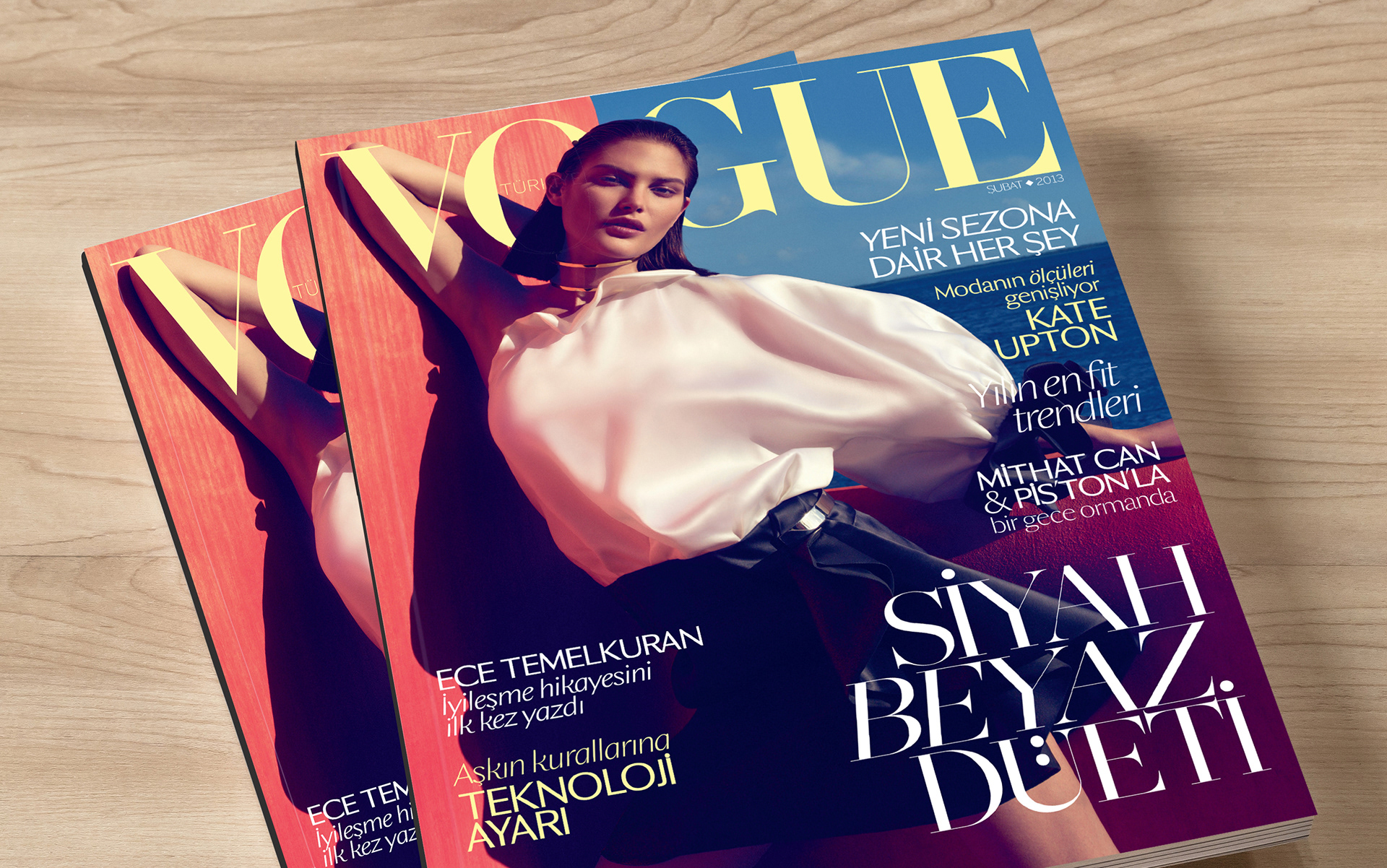
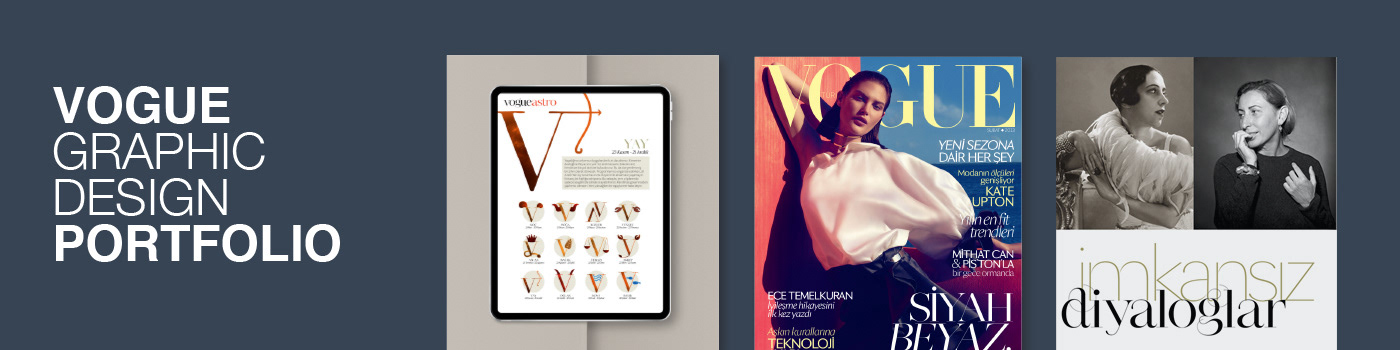
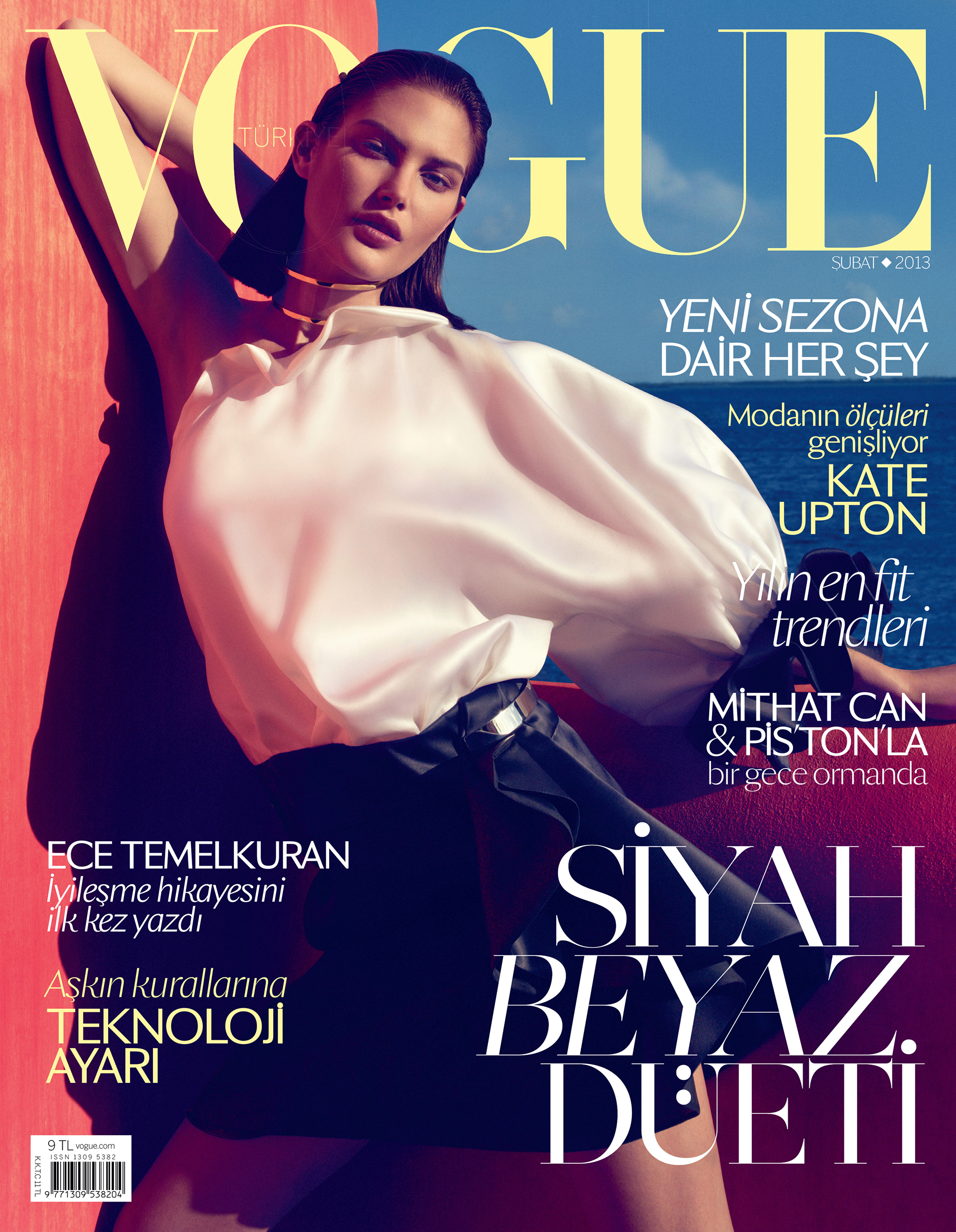
The February 2013 cover introduces warm and cold colors to sharp shadows, gently welcoming Spring. Contrasting white and curvy top emphasizes the Size Diversity article from the issue. I've chosen Dark Cream as a complementary color and used it for the logo and alternate text, harmonizing peach, blue and white. I used minimal variations in majority of typography, keeping most of the text in sans serif Sang Bleu, and in similar font sizes to provide an easy reading experience. This helped the main theme of the issue, Duet of Black and White, become prominent with the serif Narziss, and its large size. With its placement on the bottom right corner, it created an elegant balance with the Vogue logo. Photography: Miguel Reveriego, Max Vadukul, Kim Weston Arnold, Hoyningen-Huene, Guido Harari, David Sims, Steven Maisel, Conde Nast Archive, The Metropolitan Museum of Art.
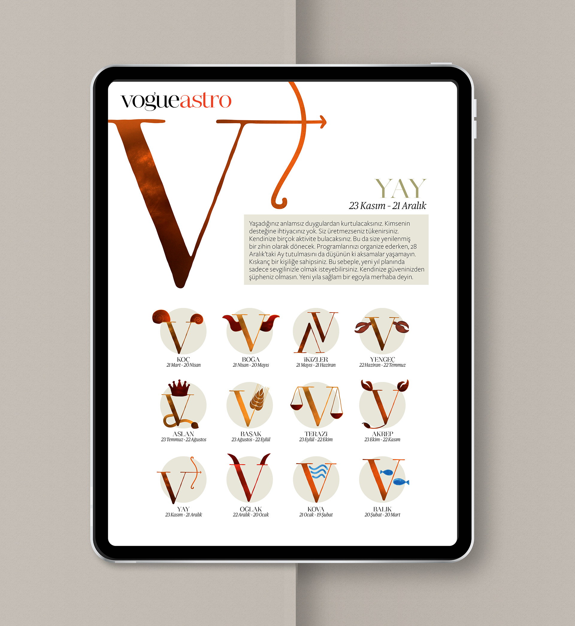
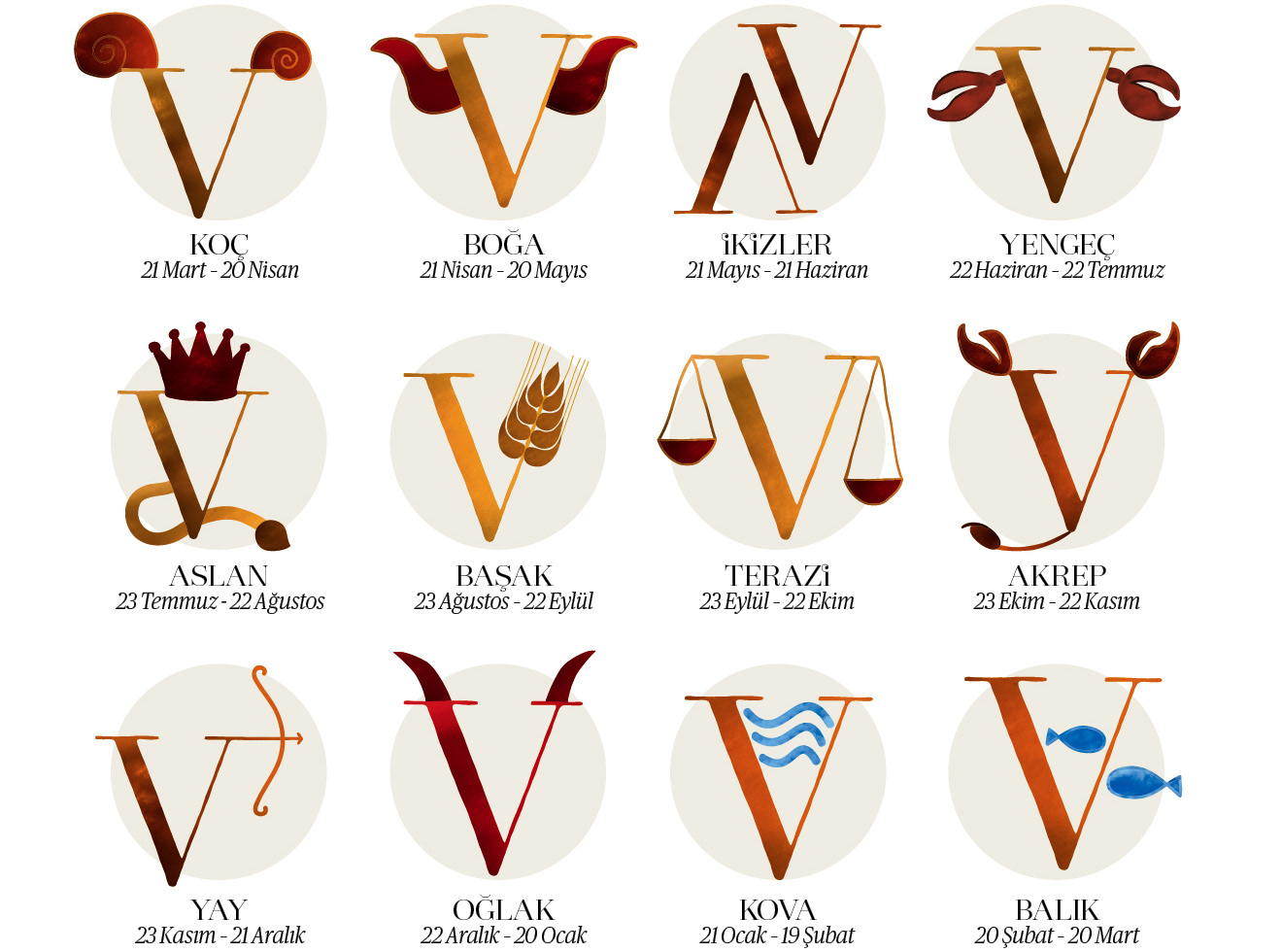
I created the astrology illustrations for Vogue Turkey, borrowing the "V" letter from its iconic logo. The color palette was built on light to dark earthy tones, with a touch of red and blue. To enhance the look and feel, I have added texture and used organic natural lines when designing the illustration set. When planning the layout, I considered both print and digital adaptations. I added a circle plate below of each astrology sign, for the list usage, when all signs are visible at once. This helped to create a cohesive look of the list, despite unique shapes and color variations of each sign. The hero sign is used stand alone, without a plate to stand out.
As an enthusiast of "less is more", my biggest inspirations were typography and geometry when designing articles. This elegantly simplistic approach blended Vogue's identity with each different theme. Making a striking first impression, the layouts allow the readers to stop and spend more time with articles.
__

__